TL;DR
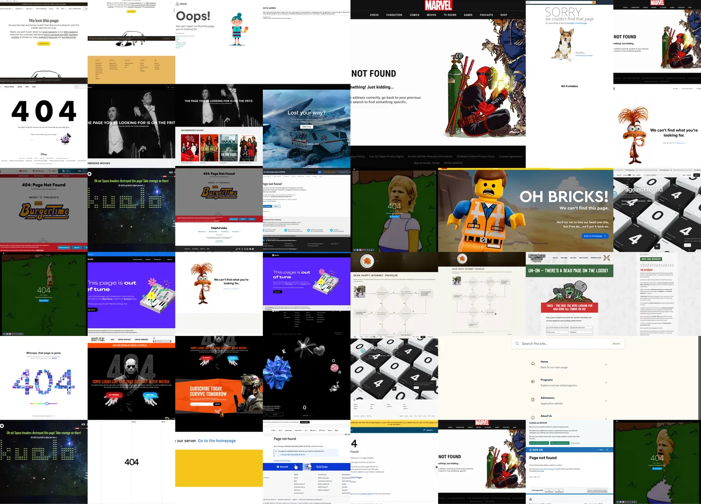
These 27 404 page examples show different ways to explain a missing page and help someone continue: familiar navigation, useful search, task-specific links and, sometimes, a brand-specific joke. Borrow the recovery idea, not just the artwork. A good starting point is a calm “Page not found” heading, one short explanation and an obvious next step.
Use the screenshots for inspiration, then adapt the page to your visitors’ goals. For implementation, see how to make a custom 404 page.
What a 404 page needs to explain
Someone followed a link or entered an address, but the requested page is missing. It may have moved, been removed or never existed at that address. That does not mean the visitor did something wrong.
“404” alone leaves the explanation to the reader. Say “Page not found” and offer a way forward. The GOV.UK page-not-found pattern recommends plain language without technical jargon, blame or an “Oops” heading. Its no-breadcrumb rule belongs to that specific pattern, not every website.
A practical design checklist
- Name the problem plainly. Use a descriptive heading and a short, non-blaming explanation. Mention a redesign or moved content only when that context is actually relevant.
- Keep the site recognizable. Retain useful branding and navigation so the page feels like part of the same website. The U.S. Web Design System’s 404 guidance recommends consistent layout, empathy and actionable next steps; it discourages whimsical treatment for its government-service context.
- Offer a route that matches the task. A home link is a fallback, not always the best destination. Add relevant sections, search or a help/contact route where they serve real visitor needs. Label destinations clearly rather than using “Click here.”
- Make recovery usable without the decoration. Keep the explanation and actions as real text and controls, not just text embedded in an illustration. Do not require a game, animation or a joke to understand what happened.
- Check accessibility in the actual page. Review the browser title, headings, link purpose, keyboard operation, visible focus, contrast, small-screen reflow and any motion against the relevant WCAG 2.2 requirements. A screenshot cannot certify any of these.
The descriptions below are visual observations reviewed on 2026-10-11, not measured usability, accessibility, performance or gameplay results. The examples are inspiration, not endorsements.
Creative and funny 404 page examples
“View example” opens a missing-page address on the original site. Sites can change; the linked page may no longer match the screenshot.
Brands
These brands use familiar characters, product imagery and playful copy, with recovery options ranging from one home button to full site navigation.
LEGO
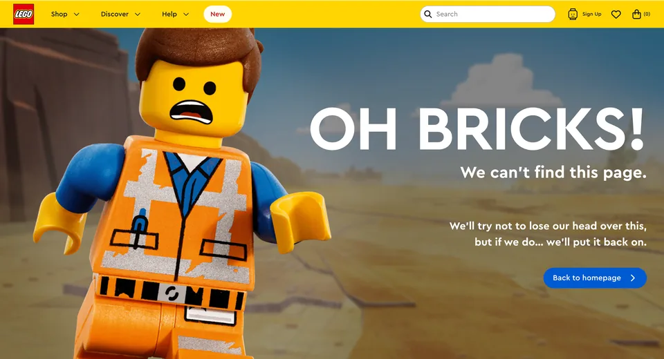
Brand humor softens the interruption; familiar navigation keeps a way forward.
- Positive observation: A literal explanation follows the brick joke.
- Positive observation: A prominent homepage button offers a clear next step.
- Positive observation: Shop navigation and a search control remain in the header.
- Takeaway: Pair a brand-specific joke with a literal explanation and a clear next step.
Mailchimp
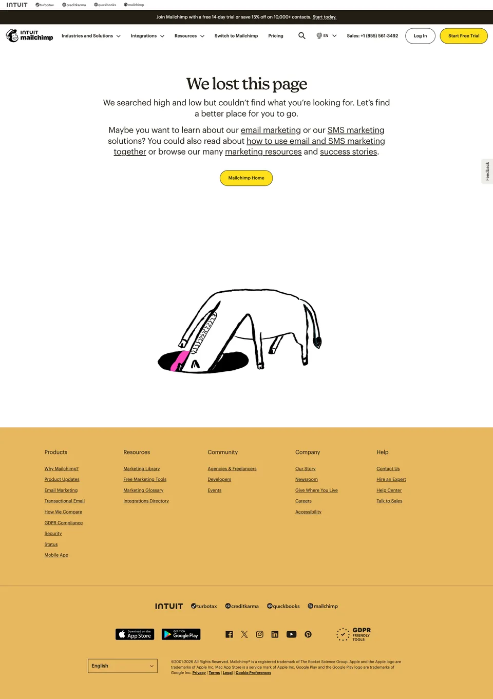
Useful destinations precede the decorative joke.
- Positive observation: Marketing-resource links appear before the illustration.
- Positive observation: A yellow home button sits close to the explanation.
- Positive observation: Header search offers another visible route.
- Takeaway: Put useful recovery links before decorative humor.
Airbnb
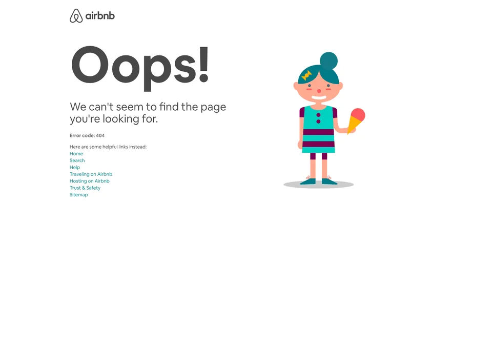
A friendly illustration accompanies several clearly named recovery paths.
- Positive observation: The missing-page explanation sits above seven recovery links.
- Positive observation: Home, Search and Help offer different ways forward.
- Positive observation: Traveling and Hosting name distinct visitor tasks.
- Takeaway: Pair a friendly illustration with clearly named destinations for different visitor needs.
Marvel
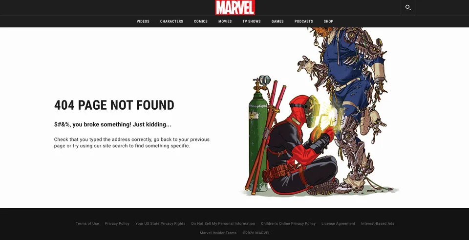
A comic-book joke surrounds practical recovery instructions.
- Positive observation: The artwork makes the error recognizable as Marvel.
- Positive observation: Advice names the address, previous page and site search.
- Question or opportunity: Could someone scanning only the mock accusation miss the reassurance?
- Takeaway: Let the brand illustration carry the joke while the recovery instructions remain literal.
Disney
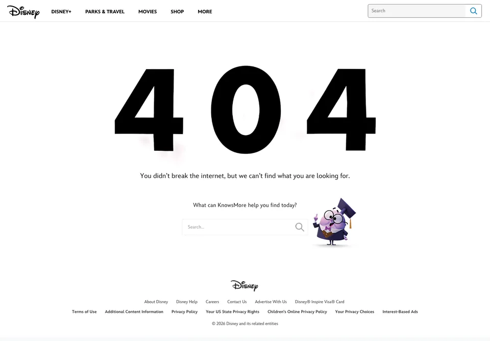
A familiar character introduces search rather than just decorating the error.
- Positive observation: The copy reassures visitors that they did not break the internet.
- Positive observation: A central search field supplies a visible next step.
- Positive observation: Header navigation, Help and Contact Us remain available.
- Takeaway: Let a brand character introduce a useful recovery action rather than merely decorate the error.
20th Century Studios
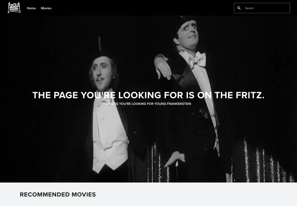
Catalog imagery gives the missing-page message a relevant theme.
- Positive observation: Young Frankenstein imagery matches the playful error wording.
- Positive observation: Home, Movies and search remain in the header.
- Positive observation: A Recommended Movies section begins below the hero.
- Takeaway: Use catalog imagery to give an error message a relevant, recognizable theme.
Netflix
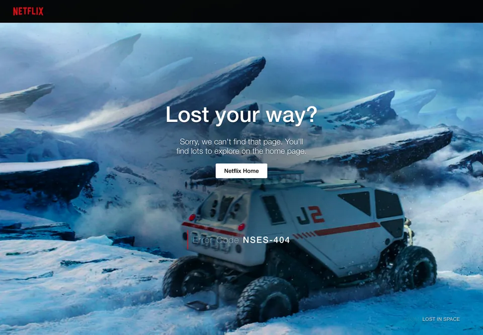
A cinematic lost-world metaphor gives one homepage action the entire stage.
- Positive observation: The cinematic scene echoes the lost-your-way message.
- Positive observation: Netflix Home is the clear primary action.
- Question or opportunity: Only a homepage route is visible; search could offer another way forward.
- Takeaway: Keep a memorable visual subordinate to an unmistakable recovery action.
Pixar
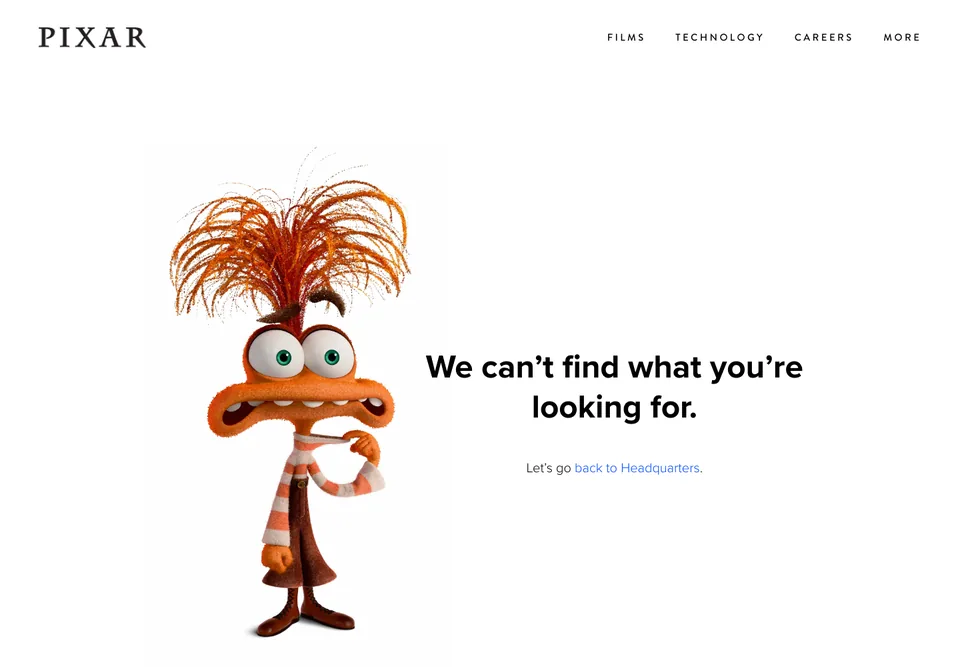
Character-world language adds personality around a literal explanation.
- Positive observation: A direct missing-page statement accompanies the character.
- Positive observation: Back to Headquarters provides a visible recovery link.
- Positive observation: Films, Technology and Careers remain in the header.
- Takeaway: Keep the explanation literal while using brand-world language for a secondary flourish.
IMDb
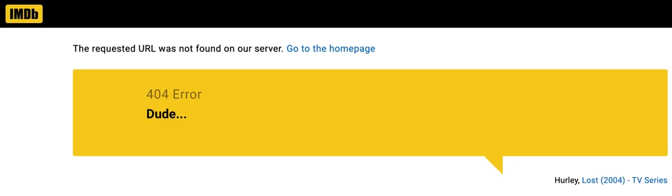
A small catalog reference adds personality without dominating recovery.
- Positive observation: A plainly labelled homepage link appears above the quote.
- Positive observation: The linked Lost credit extends the television-themed joke.
- Takeaway: A small catalog reference can add personality without overwhelming a direct recovery link.
Wendy's
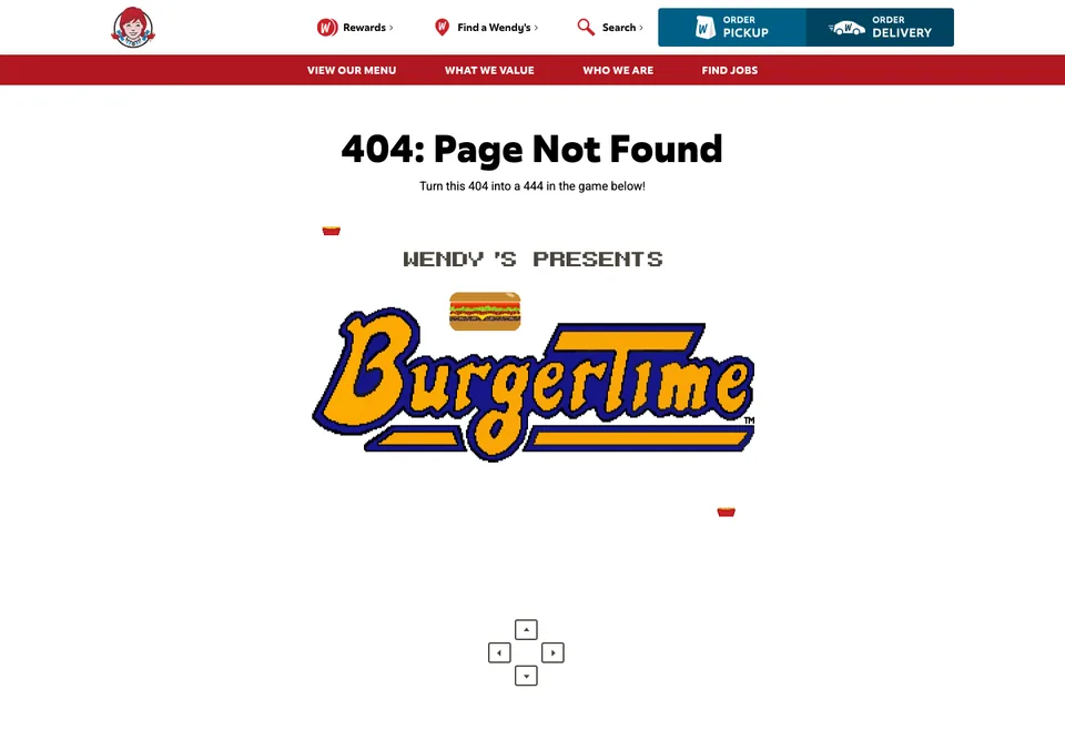
Arcade imagery sits alongside ordinary customer navigation.
- Positive observation: Pixel-art food connects the game theme to the brand.
- Positive observation: Menu, restaurant finder and search remain visible.
- Positive observation: Pickup and delivery links keep customer tasks available.
- Takeaway: Keep ordinary customer navigation available alongside a playful diversion.
9GAG
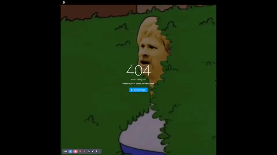
A visual nothing-here joke makes the error theme unmistakable.
- Positive observation: The character and hedge reinforce the missing-page message.
- Question or opportunity: A Download app button is visible; a direct website recovery route could help visitors continue.
- Takeaway: Motion can reinforce the error metaphor, but visitors still benefit from a direct route back to website content.
Spotify
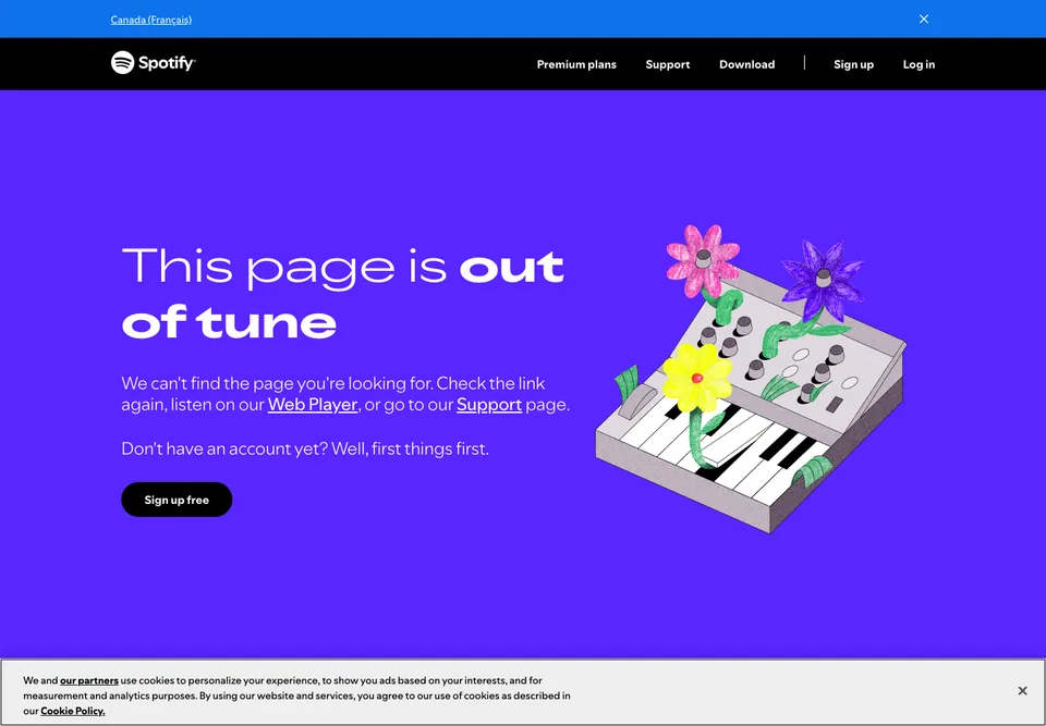
A music metaphor accompanies explicit product and support routes.
- Positive observation: The synthesizer illustration connects the page to the product.
- Positive observation: Underlined Web Player and Support links sit in the explanation.
- Positive observation: Download and Log in remain in the header.
- Takeaway: Use a product-specific metaphor without losing explicit next steps.
Studios, portfolios and small businesses
These studios, portfolios and businesses explore decision trees, stories, arcade themes and experimental compositions.
Orange Coat
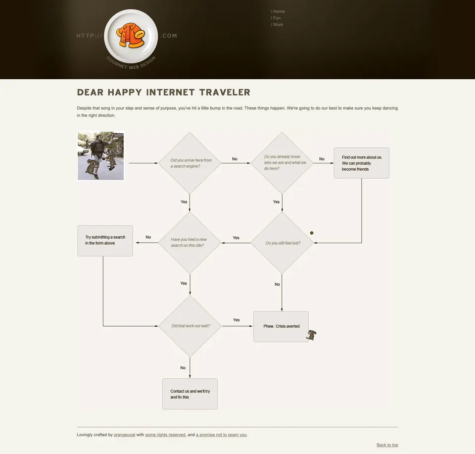
Recovery advice becomes the page’s central visual idea.
- Positive observation: A yes/no flowchart organizes possible next steps.
- Positive observation: Home, Fun and Work remain available in navigation.
- Question or opportunity: The chart mentions a search form; making that control easy to locate would support the advice.
- Takeaway: A decision-tree layout can make recovery advice distinctive rather than decorative.
Business Casual Copywriting
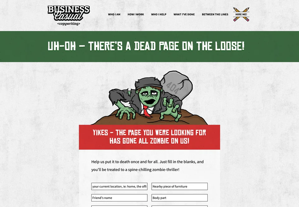
The error concept demonstrates the writer’s craft.
- Positive observation: A zombie and fill-in-the-blank fields establish a story premise.
- Positive observation: Background, process, clients and work remain in navigation.
- Positive observation: Hire Me gives a direct business destination.
- Takeaway: Let the error concept demonstrate your craft while retaining normal business navigation.
Dribbble
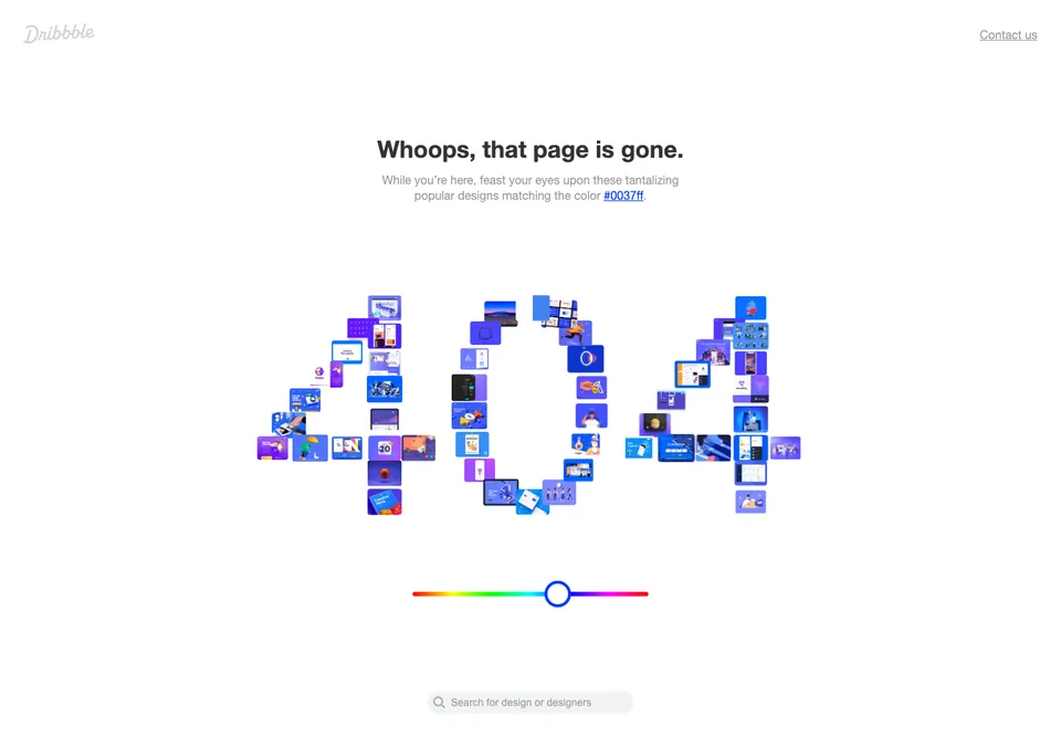
Real portfolio content becomes the error artwork.
- Positive observation: Design thumbnails form the 404 numerals.
- Positive observation: Design/designer search offers a discovery route.
- Positive observation: A linked color value and Contact us appear below.
- Takeaway: Use real site content as the error artwork and offer a route back into discovery.
Ready to Go Survival
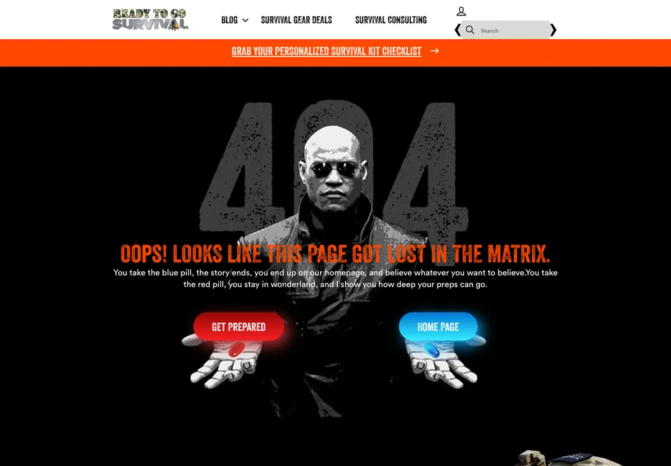
Themed choices remain understandable through explicit labels.
- Positive observation: Red and blue pills connect the artwork to the two choices.
- Positive observation: Get Prepared and Home Page name their destinations.
- Positive observation: Search, blog, gear deals and consulting remain available.
- Takeaway: Make themed choices understandable through destination labels, not color or cultural references alone.
Nothin
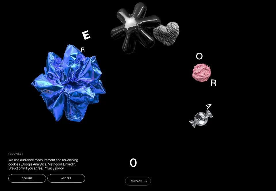
An experimental composition retains a plainly labelled exit.
- Positive observation: Metallic objects and scattered lettering create a distinctive scene.
- Positive observation: A Homepage button anchors the composition.
- Question or opportunity: Would a single readable missing-page heading make the scattered message easier to scan?
- Takeaway: An experimental error composition still needs a stable, plainly labelled exit.
Awwwards
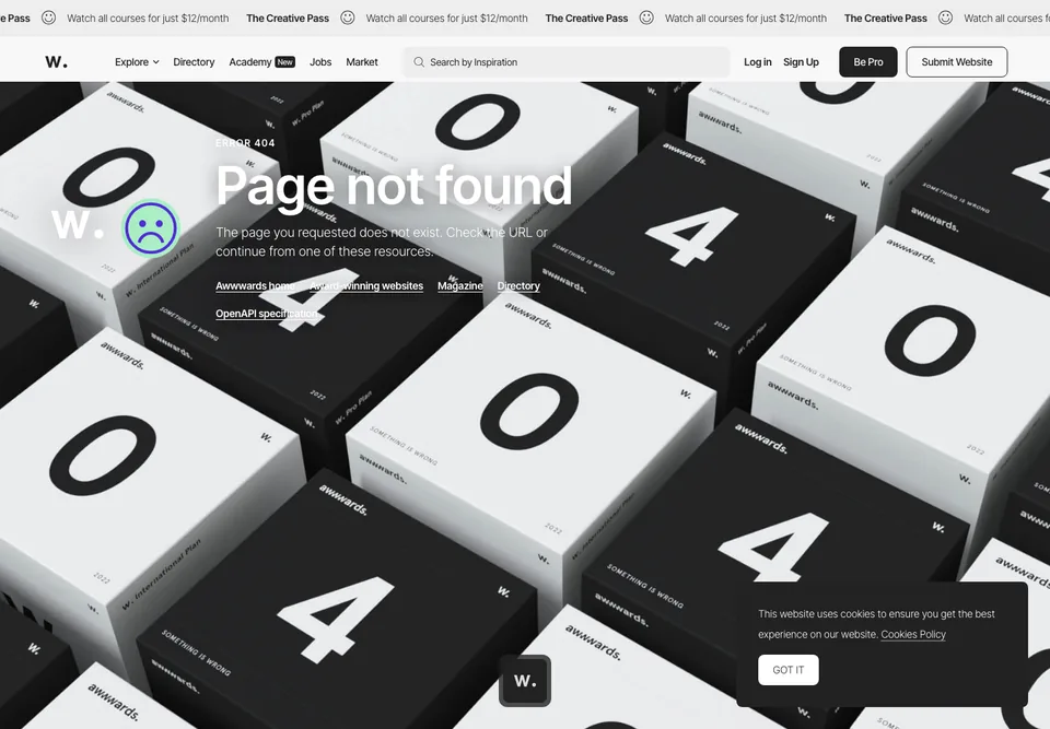
Distinctive artwork accompanies audience-specific resources.
- Positive observation: Foreground copy names the error.
- Positive observation: Home, award-winning websites, Magazine and Directory offer concrete destinations.
- Question or opportunity: Text crosses a busy background; check contrast in the actual page.
- Takeaway: Pair distinctive artwork with recovery destinations relevant to the site's audience.
Kualo
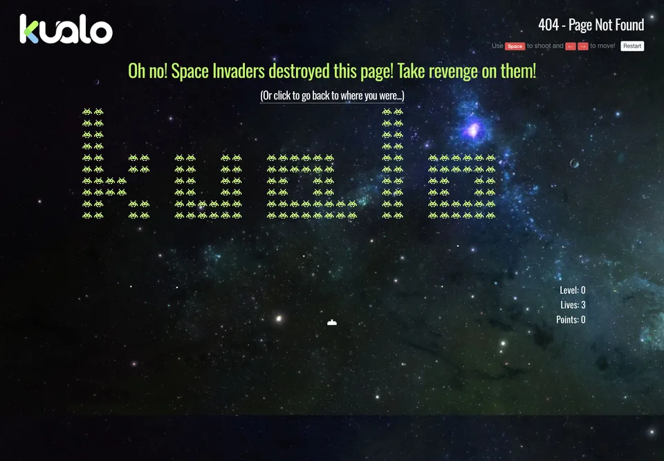
An arcade-themed diversion includes a visible navigation escape.
- Positive observation: Alien sprites and score counters establish the arcade theme.
- Positive observation: An underlined link offers to return to the previous page.
- Question or opportunity: A reliable site destination could also help someone arriving directly.
- Takeaway: Keep an immediate navigation escape beside any game-themed diversion.
Maximilian Kaspar
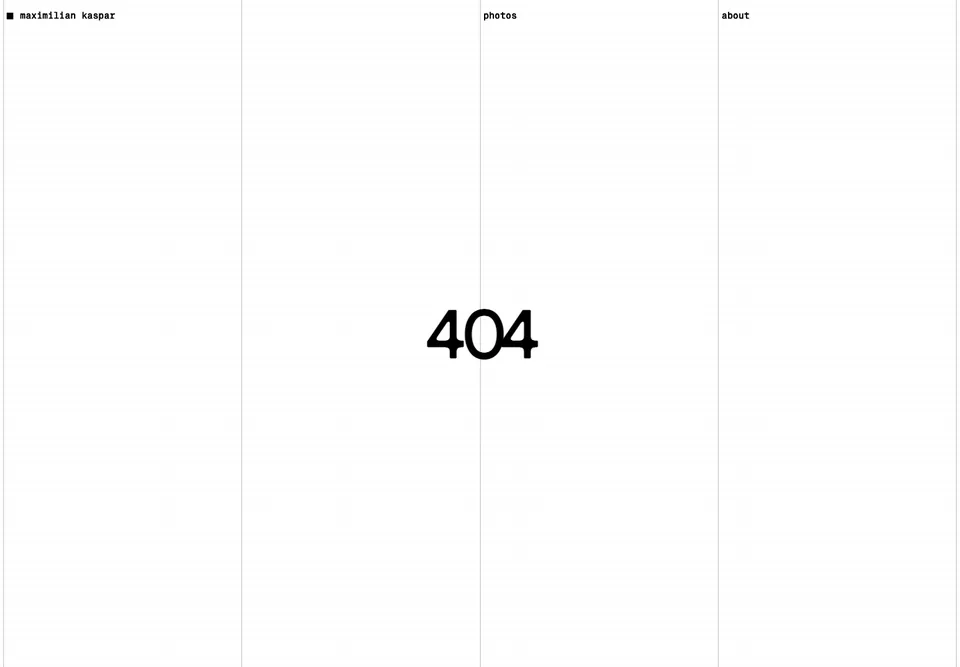
A restrained grid preserves site identity and navigation.
- Positive observation: The minimal page retains the site’s top navigation.
- Positive observation: Photos and About offer visible destinations.
- Question or opportunity: A plain-language explanation could clarify what the 404 numeral means.
- Takeaway: A minimal error page can retain identity through its grid and familiar navigation.
Public services and docs
These public-service and documentation examples emphasize explanations and recovery routes, with less reliance on a visual joke.
Confederation College
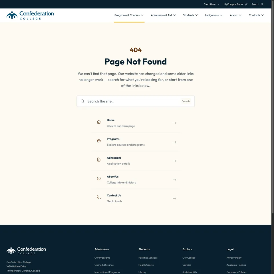
A nonblaming explanation and described destinations help visitors choose their next move.
- Positive observation: The explanation connects older links to a site change without blaming visitors.
- Positive observation: A search control sits beside described quick links.
- Positive observation: Home, Programs, Admissions and Contact Us offer distinct destinations.
- Takeaway: Explain the relevant cause and label alternatives with enough context to choose.
Niagara Region
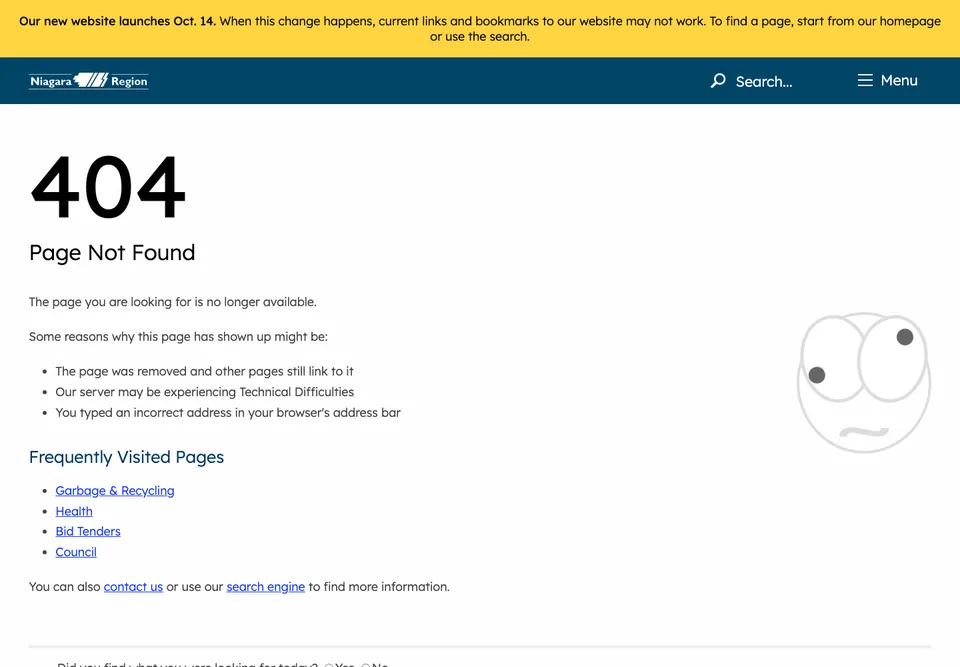
Site-change context accompanies common public-service destinations.
- Positive observation: A straightforward explanation sits beside a restrained illustration.
- Positive observation: A website-launch notice supplies relevant context.
- Positive observation: Garbage & Recycling, Health, Bid Tenders and Council name service routes.
- Takeaway: Offer common service destinations when site changes may disrupt familiar links.
GOV.UK
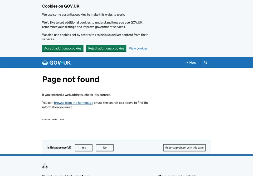
Plain language and familiar navigation carry the error page.
- Positive observation: Page not found states the problem directly.
- Positive observation: Short recovery paragraphs avoid relying on artwork.
- Positive observation: Homepage, search, Menu and problem reporting remain visible.
- Takeaway: Plain language and recognizable recovery paths can carry the entire error page.
U.S. Web Design System
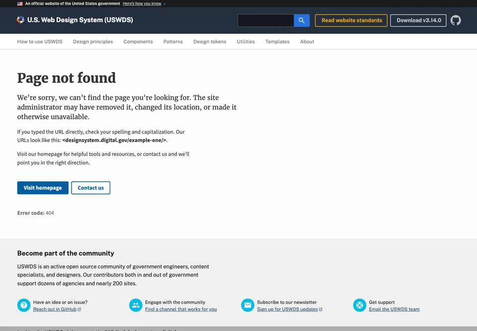
Concrete troubleshooting sits alongside self-service and human-help routes.
- Positive observation: The explanation distinguishes moved pages from typing mistakes.
- Positive observation: A sample URL makes the advice concrete.
- Positive observation: Homepage and Contact us buttons offer different recovery paths.
- Takeaway: Combine concrete troubleshooting guidance with both self-service navigation and a human-help route.
Plain but useful
These restrained examples range from visitor-facing recovery to owner-facing troubleshooting.
Amazon
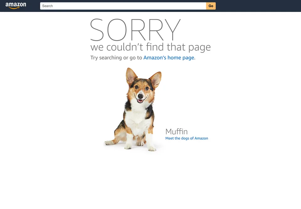
A friendly photograph does not displace search or recovery.
- Positive observation: A named office dog adds a personal touch.
- Positive observation: Search and the homepage link remain prominent.
- Positive observation: The dog-themed link provides a separate optional detour.
- Takeaway: Use a friendly image to soften the error without displacing search or the primary recovery link.
MDN Web Docs
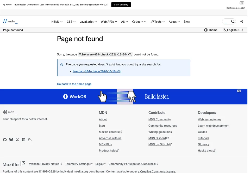
The requested URL becomes a starting point for recovery.
- Positive observation: The failed path is repeated in the explanation.
- Positive observation: A suggested site-search link uses the requested slug.
- Question or opportunity: Could editable search terms avoid an unhelpful or sensitive URL fragment?
- Takeaway: Use the failed URL as a starting point for recovery rather than showing only a generic error.
GitHub Pages default
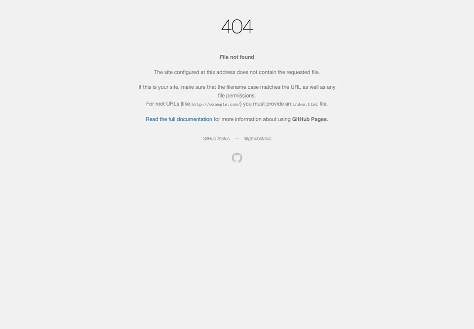
Owner-facing diagnostics need a separate visitor recovery path.
- Positive observation: Filename, permissions and index-file advice addresses publishing problems.
- Positive observation: Documentation and status links support owner troubleshooting.
- Question or opportunity: A site-specific home or content link could help ordinary visitors.
- Takeaway: Technical diagnostics suit owners, but ordinary visitors also need a route back into the affected site.
What to borrow from these designs
Brand continuity without losing the message
LEGO uses a minifigure and brick language; Pixar uses a character and “Headquarters” wording. Both keep an explanation and recovery route alongside the brand reference. The transferable idea is continuity: use your own visual language, but let someone who misses the joke still understand the page.
GOV.UK and USWDS show the quieter alternative. A direct heading, brief explanation and familiar navigation do not need an elaborate illustration. Neither approach is evidence of better conversion or faster loading; those outcomes would need testing on your site.
A reassuring voice, not a joke at the visitor’s expense
Disney explicitly says the visitor did not break the internet, then offers search. Marvel makes a mock accusation before softening it with a joke. That reversal fits a comic-book voice, but someone scanning only the first line could miss the reassurance. For a new design, keep the core message non-blaming and put any humor around it, not in place of it.
Recovery destinations that match the visitor’s goal
Airbnb names different tasks, including traveling, hosting and help. Confederation College, built by this article’s author, adds short descriptions to its quick links. Both suggest a useful question for your own page: where would someone go to continue the task they came for?
MDN derives a search suggestion from the requested URL. That is a starting point rather than proof that a result will be useful: in this capture, the suggestion contains an artificial slug. If you use this pattern, make the suggested terms editable and handle unhelpful or sensitive URL fragments carefully.
The tradeoffs behind playful and minimal designs
Kualo gives its arcade-themed page a back link, but that is a limited escape for someone arriving directly from a bookmark or external link. Add a reliable site destination alongside “Back”; the screenshot does not establish whether the game works or is keyboard accessible.
The GitHub Pages default explains filename and publishing issues to the owner, not how an ordinary visitor can find the intended content. A custom page can retain that useful owner support elsewhere while giving visitors site-specific navigation. Similarly, Maximilian Kaspar’s minimal design retains navigation, but the numeral alone leaves the missing-page explanation unstated.
FAQ
Should a 404 page be funny?
Humor is optional. Choose it only when it fits the brand, audience and task, with a literal explanation and recovery actions still easy to find. A playful shop and an urgent public service have different needs; USWDS discourages funny or whimsical error pages in its service context. The screenshots do not establish that humor reduces anxiety or improves task completion.
Is a home button enough?
It is a useful fallback, especially on a small site. On a larger site, a relevant section, search or help route may be closer to the visitor’s goal. Do not add every possible destination: choose a few clear options and make their labels describe where they lead.
Can I copy one of these designs?
Use the patterns for inspiration, not as a license to reuse the artwork, characters, screenshots or copy. Those materials belong to their respective owners; attribution alone does not grant reuse rights. Make your own assets and wording, or obtain the necessary permission or license.
Does a creative design make the page accessible?
No. Nor does a plain design automatically make it accessible. A still image cannot establish keyboard behavior, focus order, screen-reader output, search behavior or motion controls. Use the design checklist above, then test the implemented page rather than treating this gallery as an accessibility ranking.
Before you publish
- Return an actual 404 for a missing URL. A “Page not found” design served as a successful 200 response is not a substitute. Google’s HTTP guidance says URLs returning 404 are not considered for indexing and already indexed URLs returning 404 are removed. Check the missing address, not only a preview route; see the custom 404 guide for setup and checks.
- Leave missing pages out of the sitemap. Google says to include URLs you want in search results. Sitemap omission is not an indexing block. For a genuine 404 response, Google ignores the returned content, so
noindexis redundant. A separate/404demonstration served as 200 can use a crawlablenoindexdirective to stay out of results, but that cannot replace proper error responses for missing URLs. - Give the browser tab a descriptive title. “Page not found | Your brand” explains the page’s purpose, in line with WCAG’s page-title requirement. One shared missing-page template title is fine; you do not need unique metadata for every nonexistent address. A meta description is optional on an error page: Google sometimes uses descriptions for search snippets, but content returned with a true 404 is not indexed.
- Monitor broken journeys, especially after a redesign. USWDS recommends tracking missing pages and where visitors came from. Fix source links and redirect moved content to its relevant replacement when one exists. Analytics can miss visits; server logs can supplement it. Keep collected data minimized and access controlled. Do not send personal or sensitive URL paths, query strings, page titles or search terms into analytics; Google’s PII guidance covers these leakage risks. Respect applicable consent requirements; Google’s consent implementation guidance explains its controls, not a guarantee of legal compliance. See your own 404 pages and old links after a relaunch for the detailed workflow.
Create or review your own 404 page
Give an AI assistant the actual site, design or copy you want it to work with. This prompt asks it to distinguish what it saw from what it recommends and what it could not check.
Mode: [CREATE OR REVIEW]
Site: [SITE URL]
Design or copy: [SCREENSHOT OR EXISTING COPY]
Visitor’s intended task: [VISITOR GOAL]

Inspect the actual supplied website and design/copy before proposing changes.
If you cannot access them, ask me for screenshots, existing wording, navigation
and brand guidance. Do not invent observations about a site you did not inspect.

Create or review a calm, non-blaming “Page not found” heading and short body.
Keep brand continuity without making the explanation depend on a joke or image.
Recommend clearly labelled recovery actions suited to the visitor’s goal:
relevant destinations, a reliable home link, search and help where appropriate.
Do not make “Back,” a game or animation the only way out.

Review descriptive headings, browser title and link labels; identify needed
keyboard, visible-focus, contrast, reflow, screen-reader and motion checks.
Do not claim WCAG compliance from a screenshot or fabricate accessibility results.

Include a publishing checklist: actual 404 responses for missing URLs; exclude
missing pages from the sitemap, without calling omission an indexing block;
noindex is redundant on genuine 404 responses, while a separate 200-served /404
demo may use crawlable noindex but cannot replace correct missing-page responses.
Use a descriptive shared “Page not found | Brand” title; no unique metadata for
every nonexistent URL is needed. A meta description is optional on an error page:
Google sometimes uses descriptions for snippets, but true 404 content is not indexed.

Recommend privacy-aware monitoring after redesigns, with minimized data,
applicable consent requirements respected and no personal or sensitive URL/query,
page-title or search-term data sent to analytics. Consent controls alone do not
guarantee legal compliance.
Consider server logs as a supplement and point to detailed implementation guides
rather than inventing a tracking setup.

Separate your answer into Observed, Recommended and Not checked.
Only check the HTTP response on a missing URL if you have access tools available;
otherwise mark it Not checked. Do not fabricate network or accessibility results.
Do not deploy changes or enable tracking without my permission.